The making of Roundy
Goals and challenges
Roundy, meant for visually impaired children 9-12, should:
- be an example book, showing how concepts can be explained with tactile images;
- explore concepts in a wide sense, from ‘what is a drawing’, to climate change, to objects and animals and clouds (etc.) and how things work, allowing for a better understanding of the world around;
- show what ‘interwovenness’ of concepts means;
- show how knowledge gained in a preceding image can be used and built upon in a next one;
- make both adult readers and children aware of different types of images;
- teach children (and adult readers) to work with top, front and side views;
- make clear that each type of (tactile) drawing has its own ‘underlying principles’ that one must understand in order to give meaning to shapes, lines and textures;
- help readers of various levels of experience to read tactile graphics;
- make reading enjoyable and interesting for the target group;
- guide adults who read the book and/or help children explore the tactile images.
- an international audience with different ‘starting points’ per country and per child – e.g. regarding knowledge and experience, (braille) reading skills, tactile graphics reading skills, vision, intelligence, sensibility of the fingers, available support or help, etcetera.
- should Roundy be a story and/or a ‘do-book’ with stories and tips for activities?
- should we address the adult assistants ‘through’ the texts for children?
- how much text?
- what about translations? A children’s book requires a good translation.
- realize cost-effective production with all the above goals and challenges.
First version and testing
An initial version was made and tested in The Netherlands, Flanders and France with visually impaired children.
There were 15 tactile graphics, each one serving to explain a concept; see the Storyboard in 9.2 in the full edition of the guidelines. Here we show some of them.
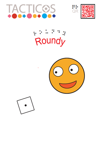
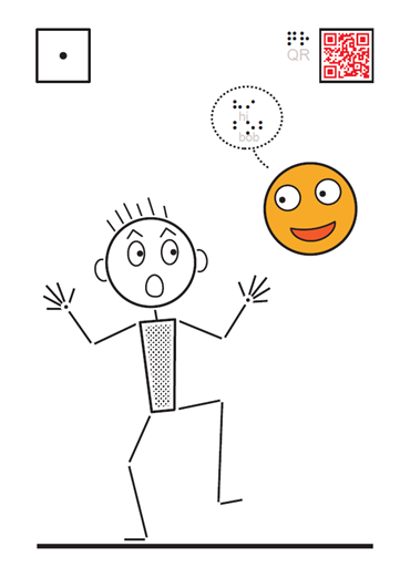
In this first row of images you see: the cover of the book, the first graphic where Bob meets Roundy and a picture of the third graphic explaining top view, front view and side view of Roundy’s rocket, together with the 3D model of the rocket.
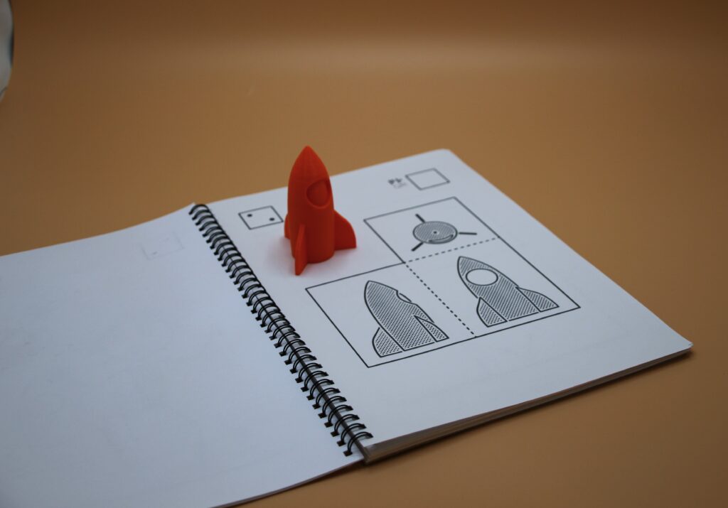
Adapting 2D images with 3D elements
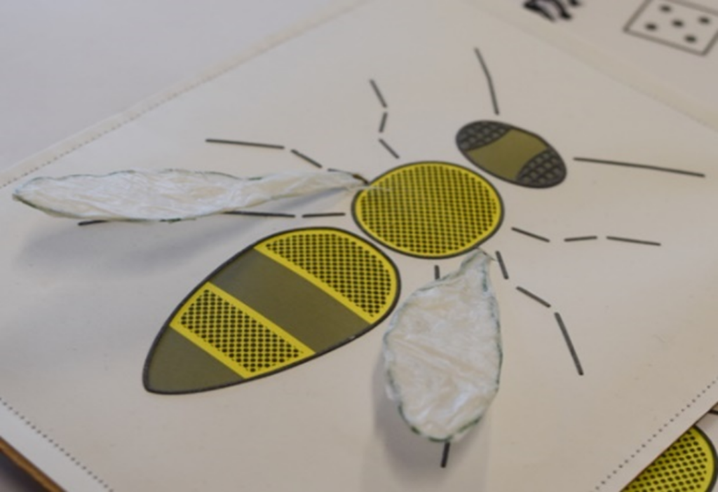
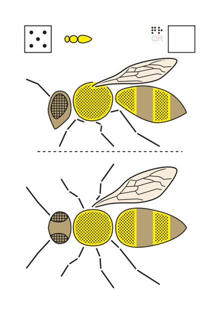
Another example is the bee: top view and front view; the side of the bee is the side facing us: the ‘front view’ or ‘view as seen from the front’. In the top view only one wing is drawn, to show the third leg, that is otherwise covered. In the tips we suggested to cut two paper wings to explain further if the child wouldn’t understand. One of the French teachers made them of iron wire and fleece, that can be lifted and made a swell drawing of the bee with 6 legs but without wings. This worked greatly for the pupils she tested with.
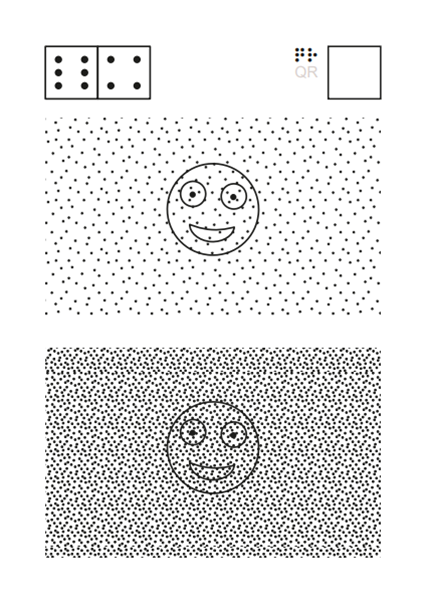
Exploring fog by touch
One last example from the test with the first version: the tactile image that by the way you shouldn’t look at with your eyes, but feel with your fingers eyes closed. When you look, in both images on the left the face of Roundy is still well visible. When you touch it is rather difficult to find Roundy in the upper drawing and almost important in the lower one on the left. In the tips we suggested to use the face of Roundy on the cover and put one or more layers of fabric on top. The more layers, the more difficult it is to find Roundy’s face; as in thick fog.
Modifications after testing
The test showed that many children thought the graphics were quite difficult and needed help, but when well explained they actually quite enjoyed them. The testers were also positive about Roundy, but thought it would be better if the chapters were more of equal length and if the stories were aimed at 9–10 year old children rather than 11–12 years.
Based on feedback from the testers the tactile graphics here and there changed places. The story was changed a bit to make it more appealing for children aged 9–10, yet keeping the extra explanation of the concepts.
The stories were translated by native speaking participants, and we were pleased with the result.
Making Roundy was a real team effort and the discussions led to many insights, that you find back in the book and the guidelines.
Economic production
Tactile books are very expensive to make. The project was also meant to find ways for more economic production in order to expand the choice of good quality tactile books.
Economic production requires:
- large amounts
- cheap reproduction (material and handling)
In order to create large amounts it will be necessary:
- to cooperate internationally
- make one book with only the tactile images for all countries
This presupposes:
- No braille in the tactile graphics since braille differs per language. (There is one exception with only lower case letters in graphic 2).
- Text and images must be separated.
Cheap reproduction:
- We now used swell paper, since we needed only few copies. Swell paper is expensive per sheet, but with only few copies it is not feasible to make a mould to emboss (see Chapter 7 in the guidelines). With large amounts however, the price per embossed copy gets much lower than the price per copy of swell paper.
Braille reading is important too. The text now can be read digitally through the QR-code . The text can be printed in braille at home or at school or by production houses for braille that often are funded to produce braille.