Tactile graphics
In our guidelines we use the term tactile images for tangible images that are meant to be explored by touch. With the term tactile graphics, we mean raised line drawings.
In tactile graphics:
- There may be some variation in height, but there is basically one level of relief.
- There is one type of material.
A general rule is: the less variation in height and materials, the fewer the possibilities to clearly display tactile details. This is further complicated by the lack of different materials.
There are many techniques to produce tactile graphics (see chapter 7 Production Techniques and Materials). They even can be made with simple ‘home, garden and kitchen tools’, such as a pinwheel, clothing paste, with Wikki Stix, by sticking woolen or cotton threads on paper, using special drawing foil, etc. These are handy for quick sketches. If you want to make good quality tactile graphics that you can reproduce, swell paper is one of the most commonly used options. This chapter focuses on that technique.
General principles for drawing clear tactile diagrams
The first task a designer of tactile graphics has, is to make an image, that helps the fingers to easily and faultlessly identify shapes and lines and details. The second task is to make a well understandable image; i.e.: use conventions or ‘underlying principles’ in order to give meaning to the lines, textures and dots. The basic rules or underlying principles to design and read tactile images are basically the same for any technique.
General tips for making easy to read tactile line drawings
- A4 is ideal as it can be covered by two hands, larger than A3 is not convenient.
- Empty space in tactile images is very important for comfortable legibility. The higher an element is, the more empty space around it is needed. These are some general figures, but please always test and proofread and keep in mind that the tactile sensibility of readers may (widely) differ.
- Add 5 mm or even more empty space around details or braille,
- Add 2 to 3 mm or even more empty space between contours and fillings,
- Add 5 mm or more empty space between two high areas.
- Fill solid shapes with a dense pattern where you don’t feel individual dots; that way it is clear ‘what belongs together.
- The fillings must feel rather smooth and preferrable are a little less high than the outline. Don’t forget the empty space.
- It is tempting to play with different shades of grey, but it may prove very difficult to get good swelling results.
- Preferably give every line with another function another width or structure. Use no more than 6 different line types in your tactile graphic.
- A tactile graphic of for example a flower is not easily recognizable on another scale! It looks the same, but feels very differently.
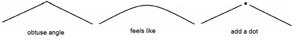
- An obtuse angle feels a bit like an arc unless you put a dot in the corner. Arrows will greatly profit from a wide arrowhead with a dot in the point too.
- Conversely, very sharp angles will be easier to recognize with an added dot too.
Braille in tactile graphics
If you are not an expert adding braille can be quite challenging. Braille is different per country. Braille on paper has round tops, whereas swell paper tends to be flatter on top, which makes reading more difficult. Please consult an expert institute to find an apt font to use in swell drawings. Please note that braille has standard dimensions; do not minimize or magnify.
- Avoid using braille as much as possible; it complicates reading the tactile graphic.
- A title in braille can be helpful though.
- Avoid using lines or arrows to indicate the part that the braille label corresponds with. These lines complicate reading the tactile graphic very much.
- Put the braille, if you cannot avoid it, to the left of the corresponding part in the graphic. If there is no place then on the right. (You can imagine it is challenging to place braille in tactile graphics).
- Many blind readers don’t like braille on swell paper because it is harder to read than braille on paper, because the braille dots are flat at the top, not round. Especially on a velvety quality of swell paper this complicates reading.